Joined Littlebird
Came on as design engineer — product and brand, all in code.


Came on as design engineer — product and brand, all in code.
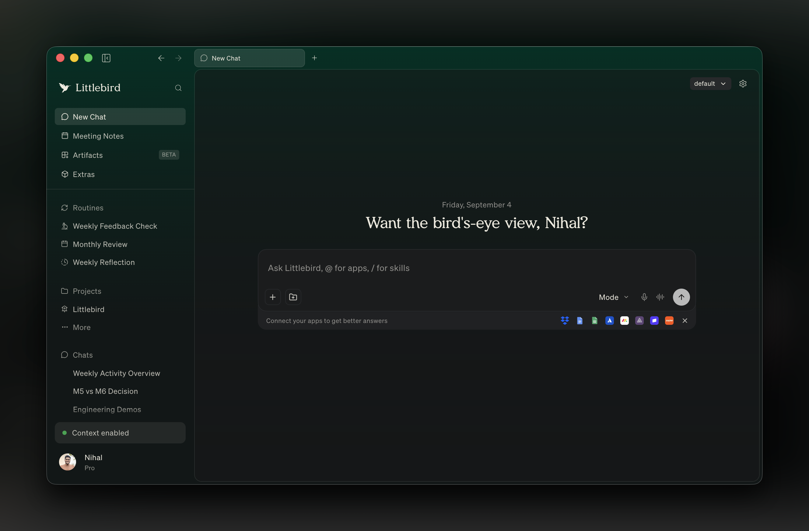
First motion in the product. Set the tone for everything after.
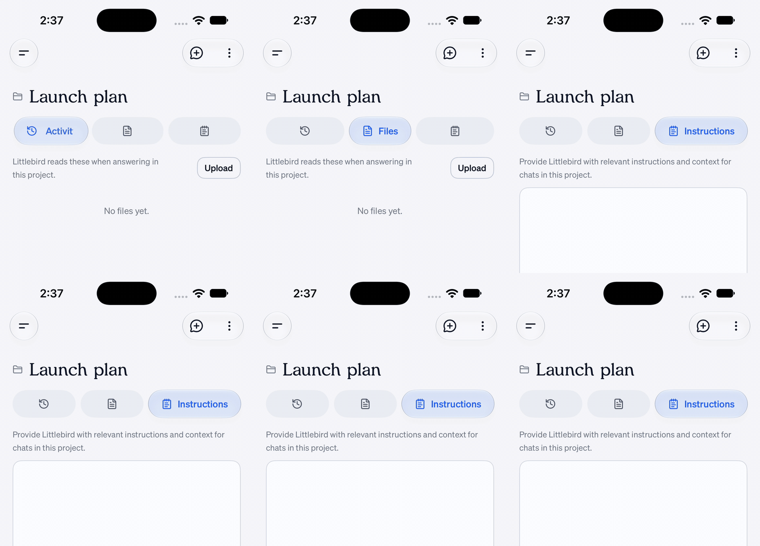
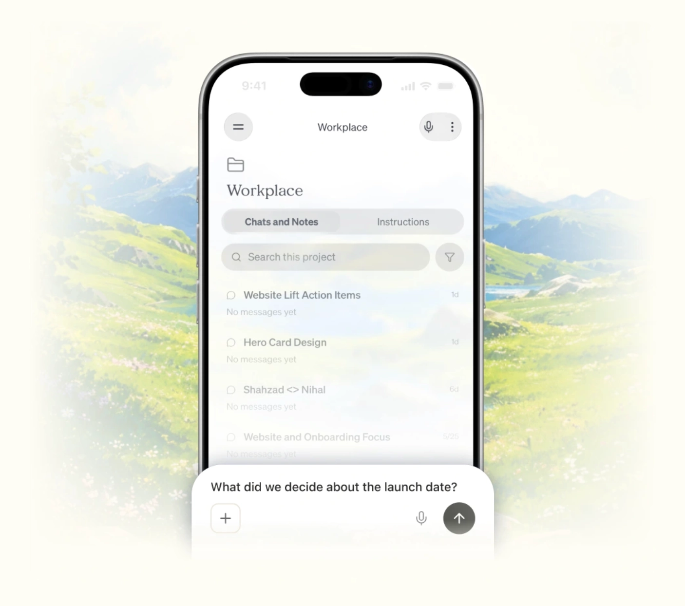
Projects didn't exist on mobile. Shipped full desktop parity in one PR.
A hidden easter egg. Small thing, a lot of delight.
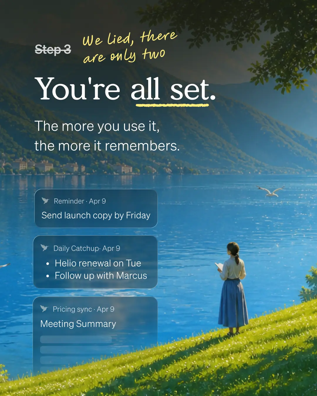
Pulled the retention data, killed the blocking setup screen, moved context learning in-app. +53% activation, 2.6× more chats in week one, 2.8× more core actions.
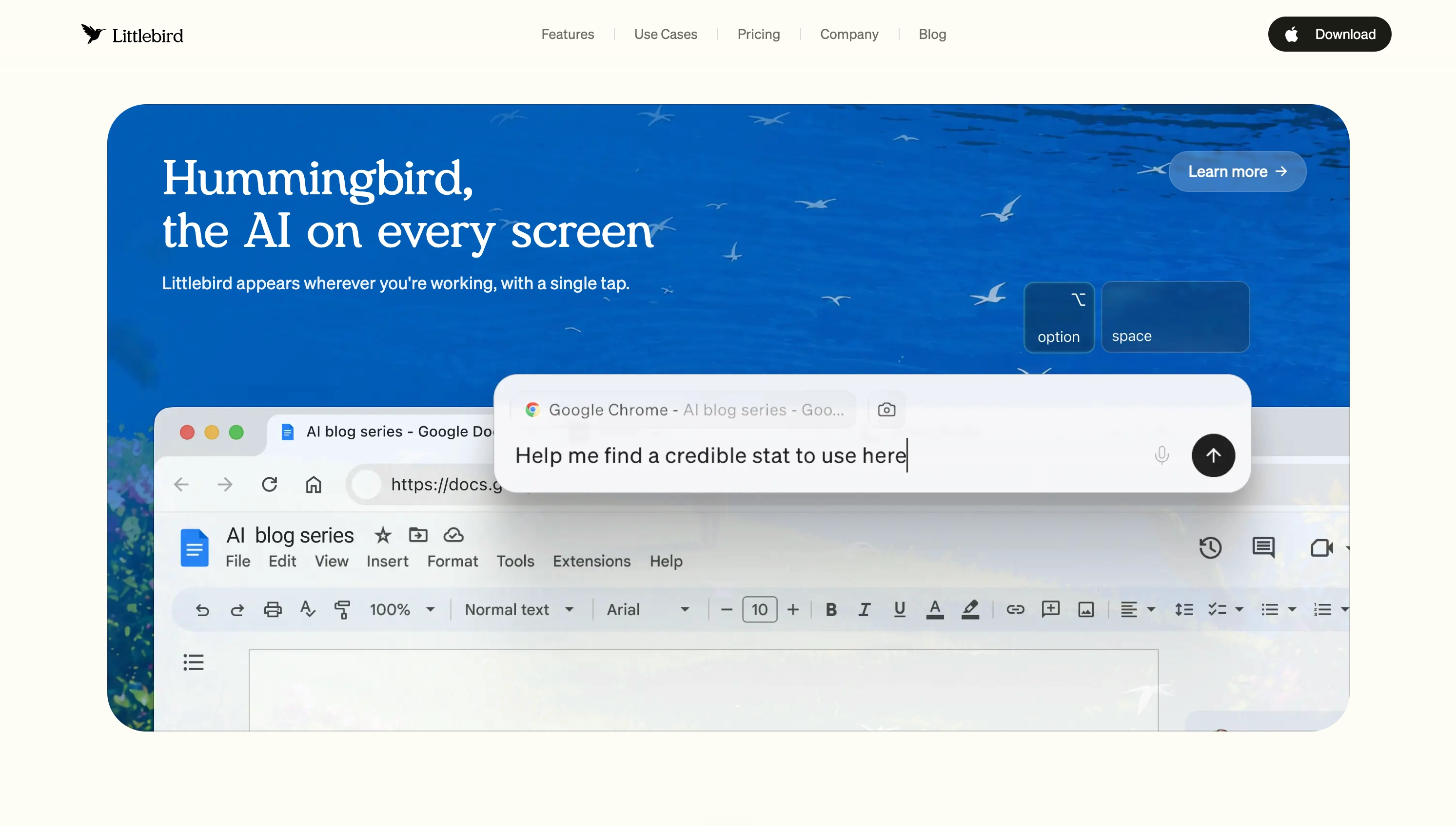
Rebuilt from the ground up. Lifted downloads, revenue, and brand presence.
Rebuilt the core meeting surface to close the gap with competitors.
No persistent chat existed around meetings. Owned the whole stack — UI, SDK, backend migration.
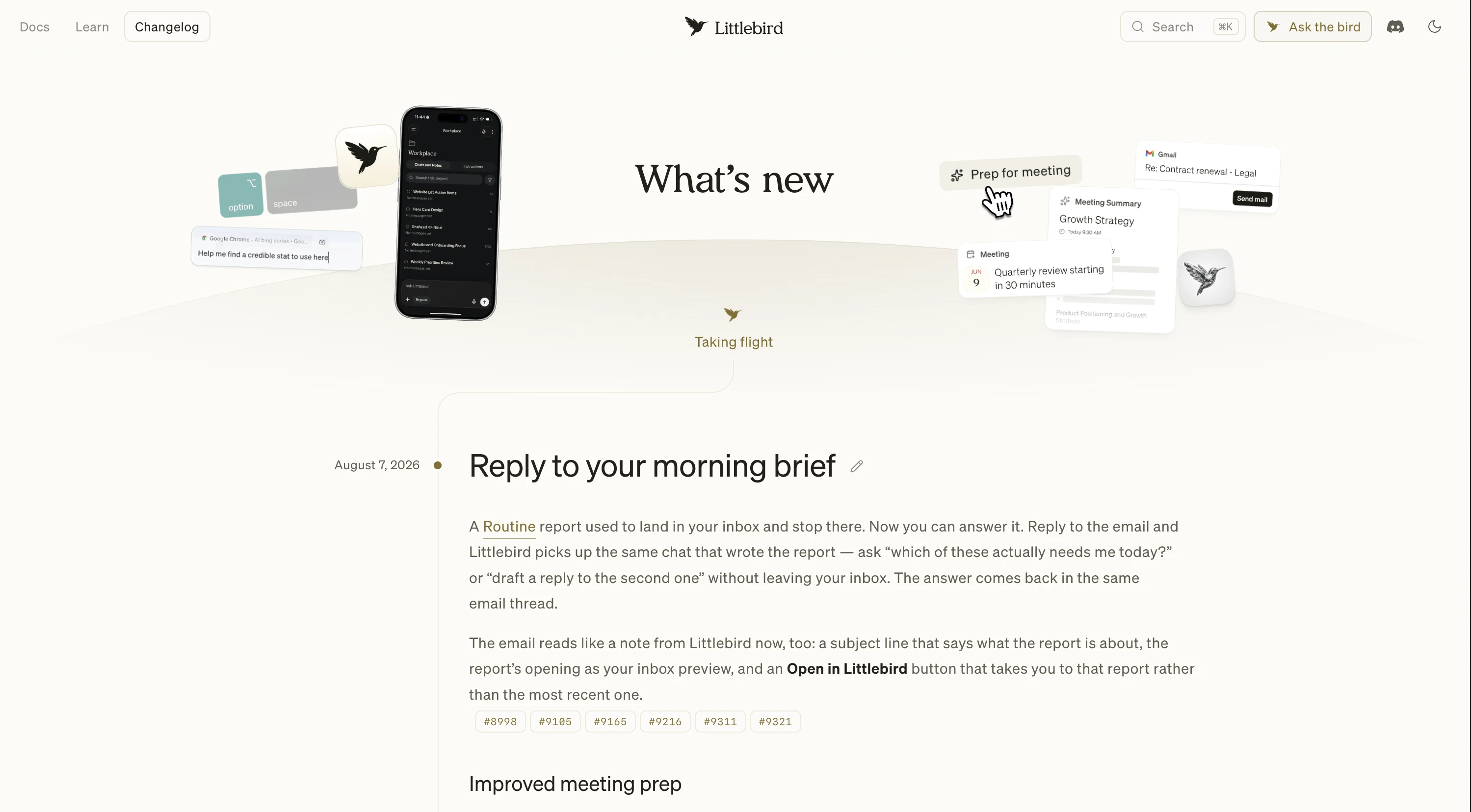
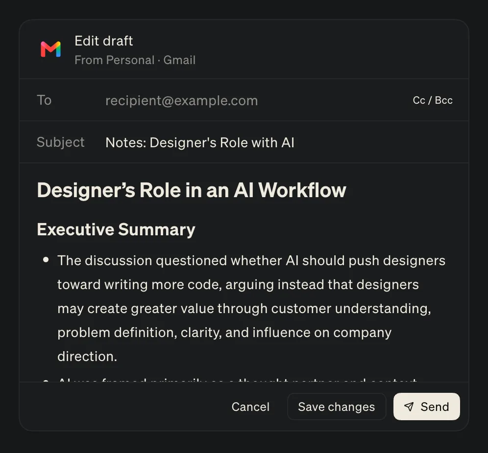
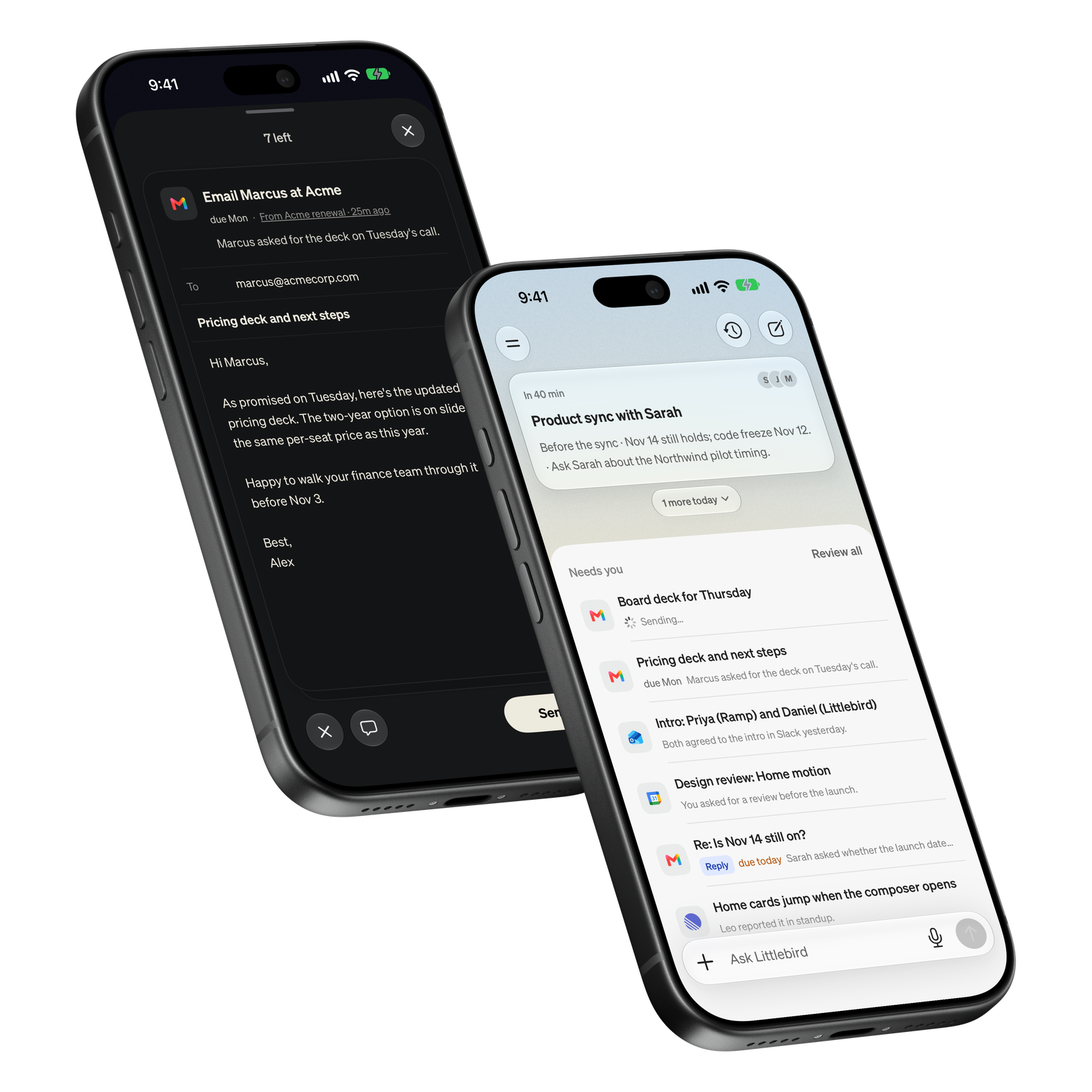
Chat could talk about the work but never act on it. Designed the whole flow — chat drafts the email, you review it, it sends without leaving the thread.
Illustration, type, and motion pulled into one system across product and brand.
Brought chat into the floating on-meeting widget — answers without leaving the call.
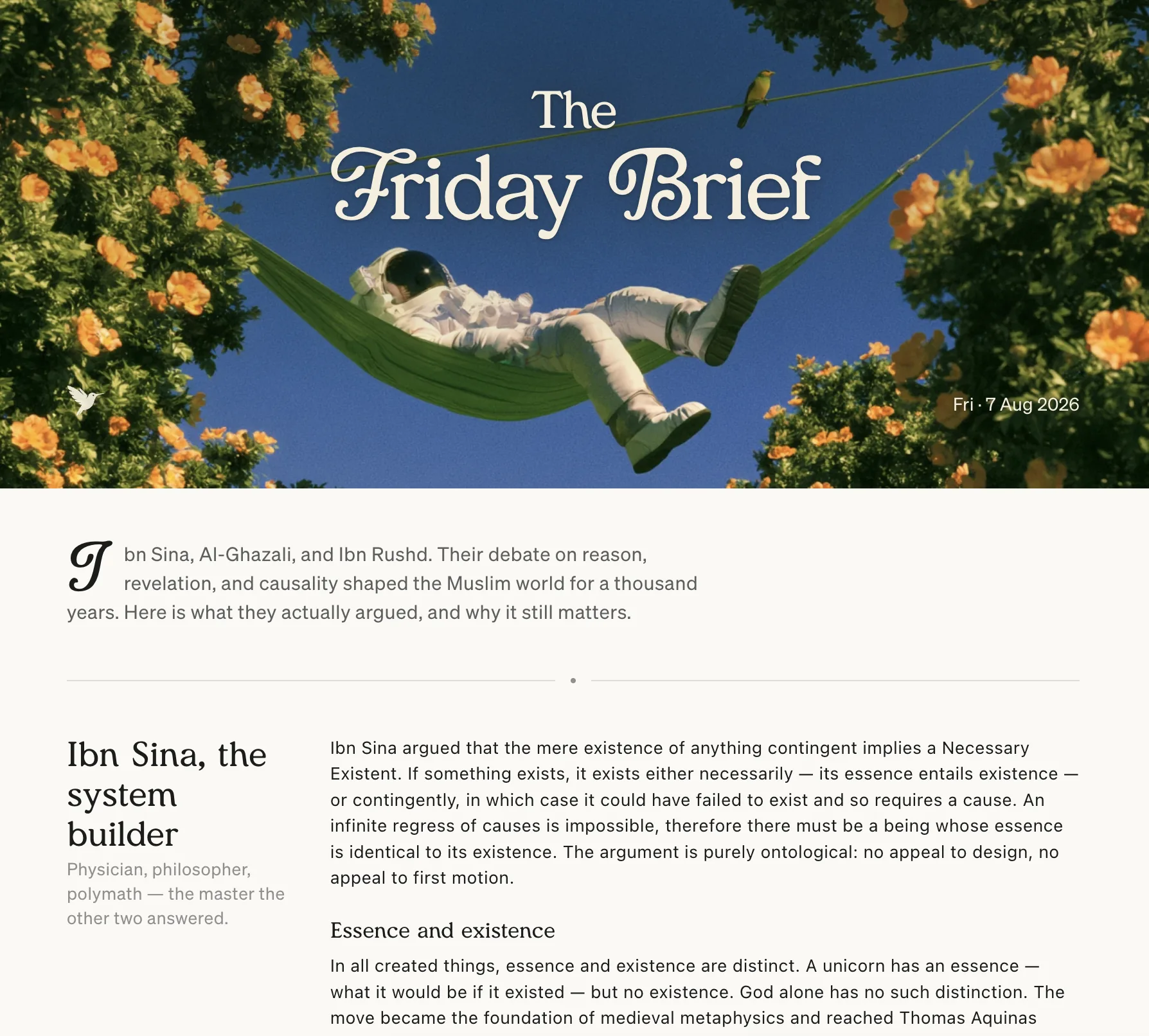
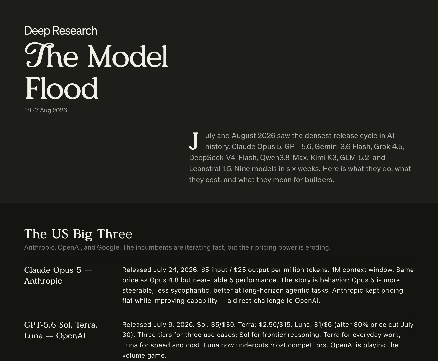
An editorial layout for generated documents. Long reports and briefs are now actually readable.
Gave the wait a shape. Reasoning streams the document as it writes, then settles into a card in the thread.
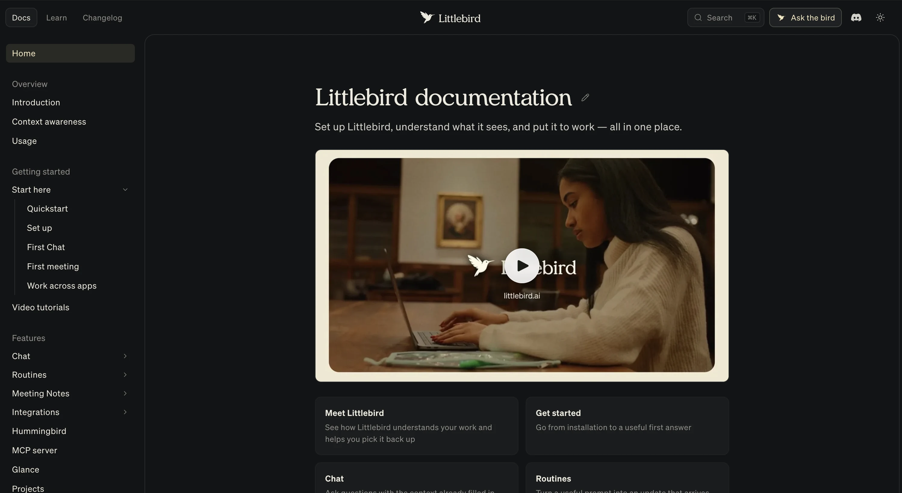
A layout refresh and visual improvements for the docs site.
Made the artifacts library easier to scan, with grid and list views for every kind of file.
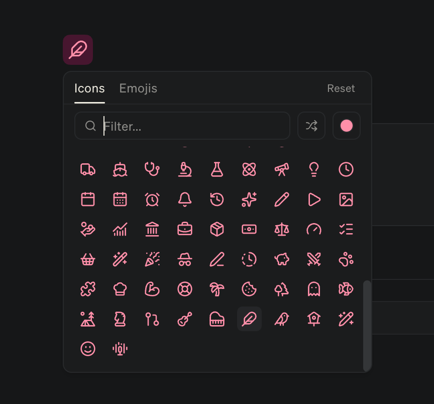
Flat, painted, gradient. Explorations for the icons people get to pick between.
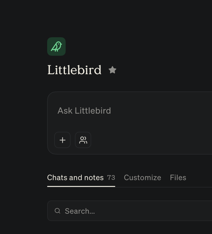
Every project gets an icon and a color of its own. Makes a long sidebar scannable at a glance.
Talking to Littlebird on mobile now has a shape. The composer folds into a live waveform and timer while you speak, then transcribes in place.
Another hidden corner, this one on desktop. Click the bird in the sidebar and it takes off into a tab of its own — pillars to dodge, a score that climbs, and a game over to send you back to work.
A ground-up pass on the app. Home, Routines, and Meetings live in one segmented bar that expands the tab you're on, the composer follows you everywhere, and the surfaces that were desktop-only finally have mobile equivalents.
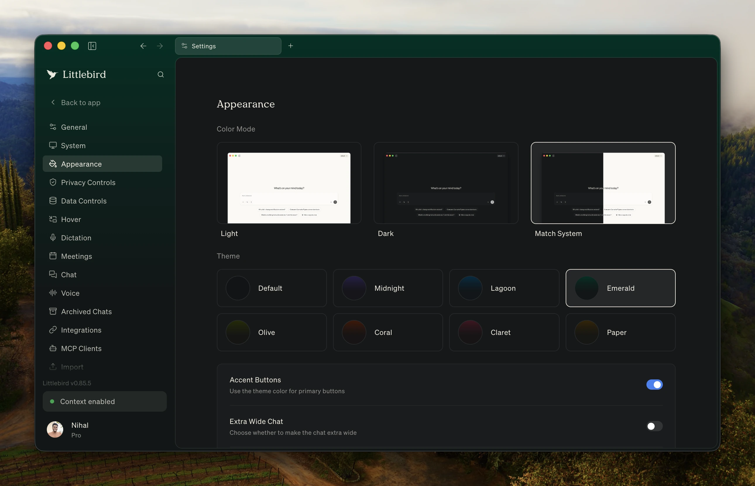
Midnight, Lagoon, Emerald, Olive, Coral, Claret, Paper, and the default green — each with a light and a dark mode. You pick from the command palette and the whole app re-colors without leaving what you're on.
A raw transcript carries a lot you'd never send anyone. Chunks select on click, a bar keeps count, and the run copies out or deletes in one move.
Fourteen sections were fighting over one dialog. Settings is a full page in its own tab now, with room for the previews and toggles to read at a glance.
Shipping fast only counts if people notice. Releases now land as a pill at the foot of the sidebar that unfolds into the whole note.
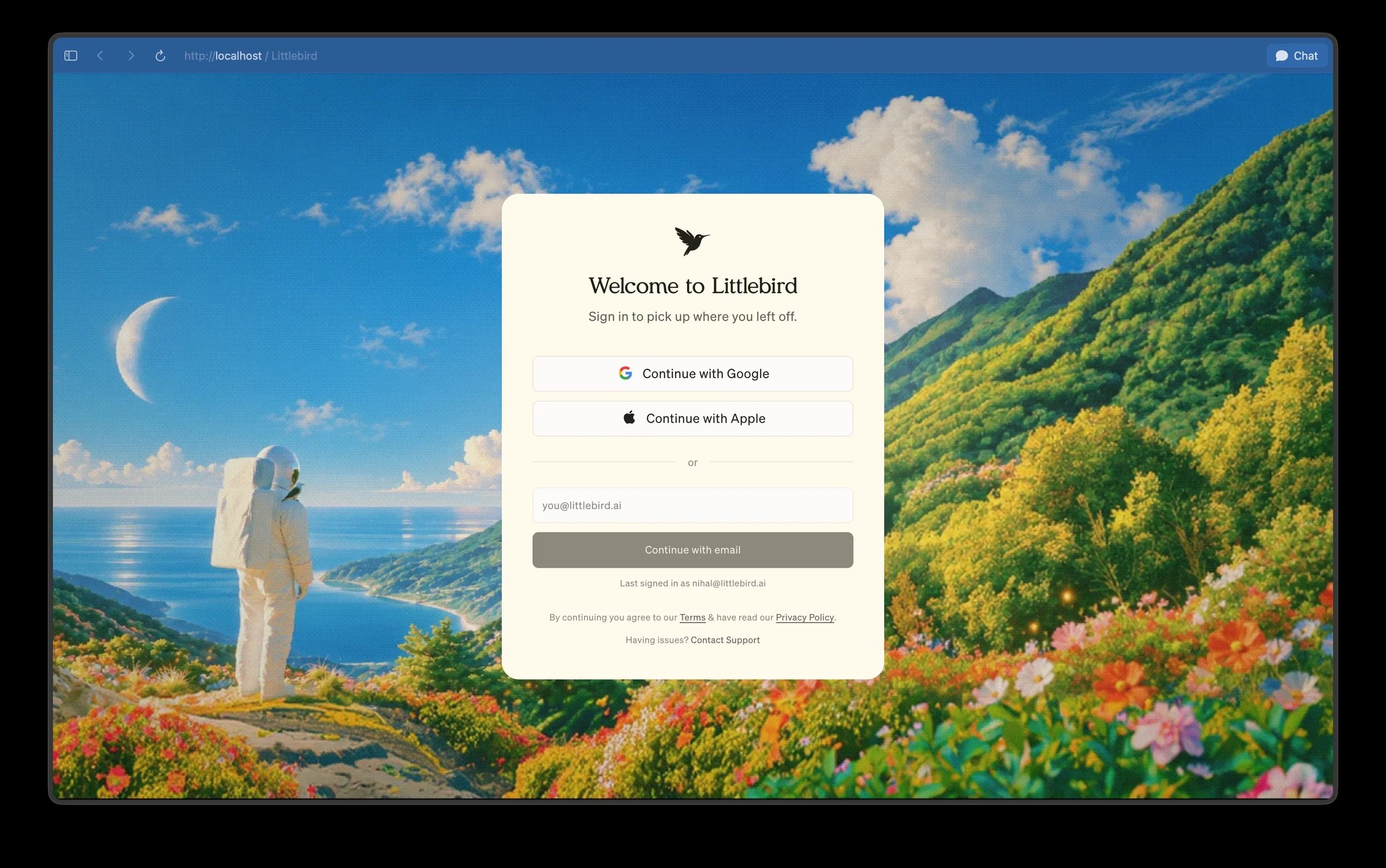
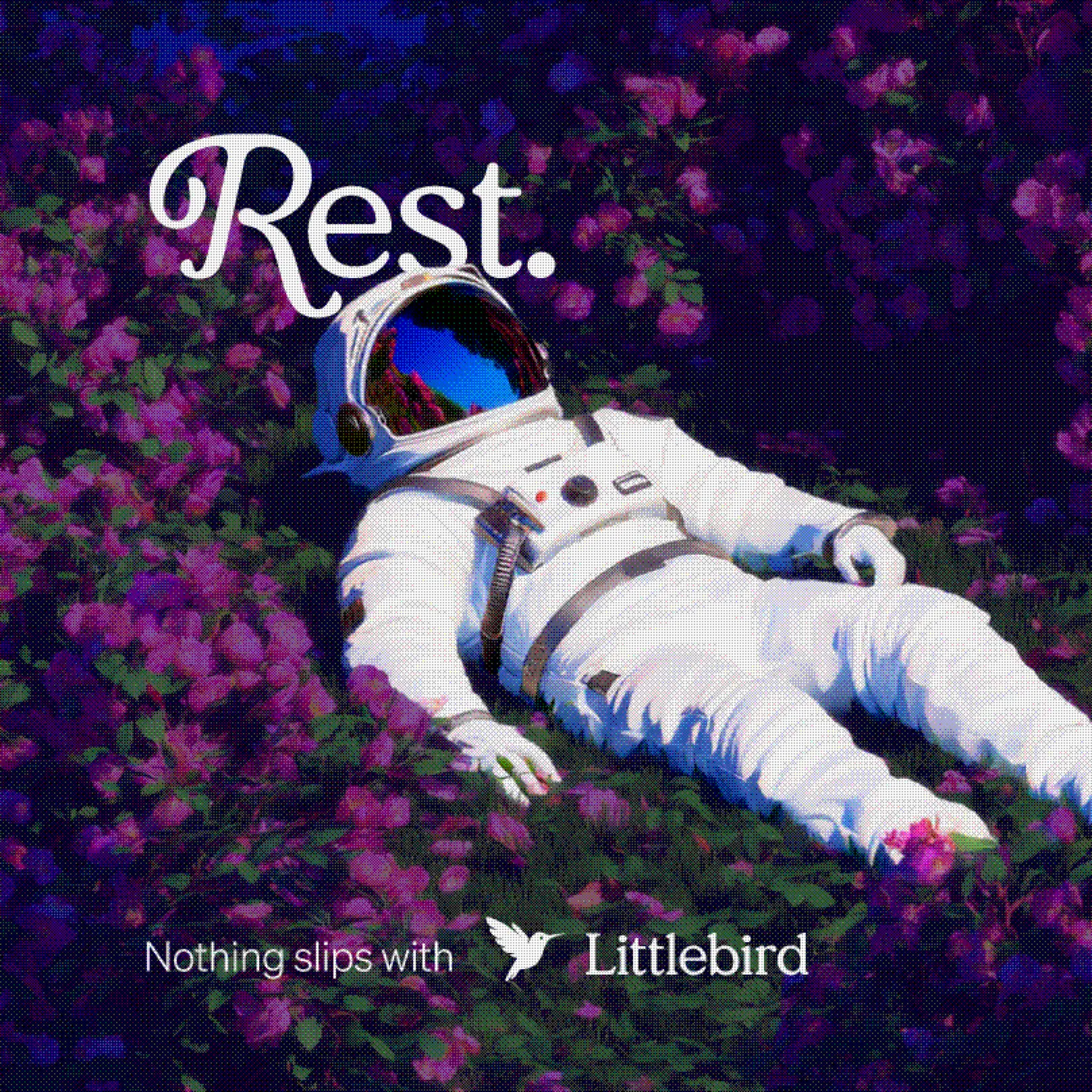
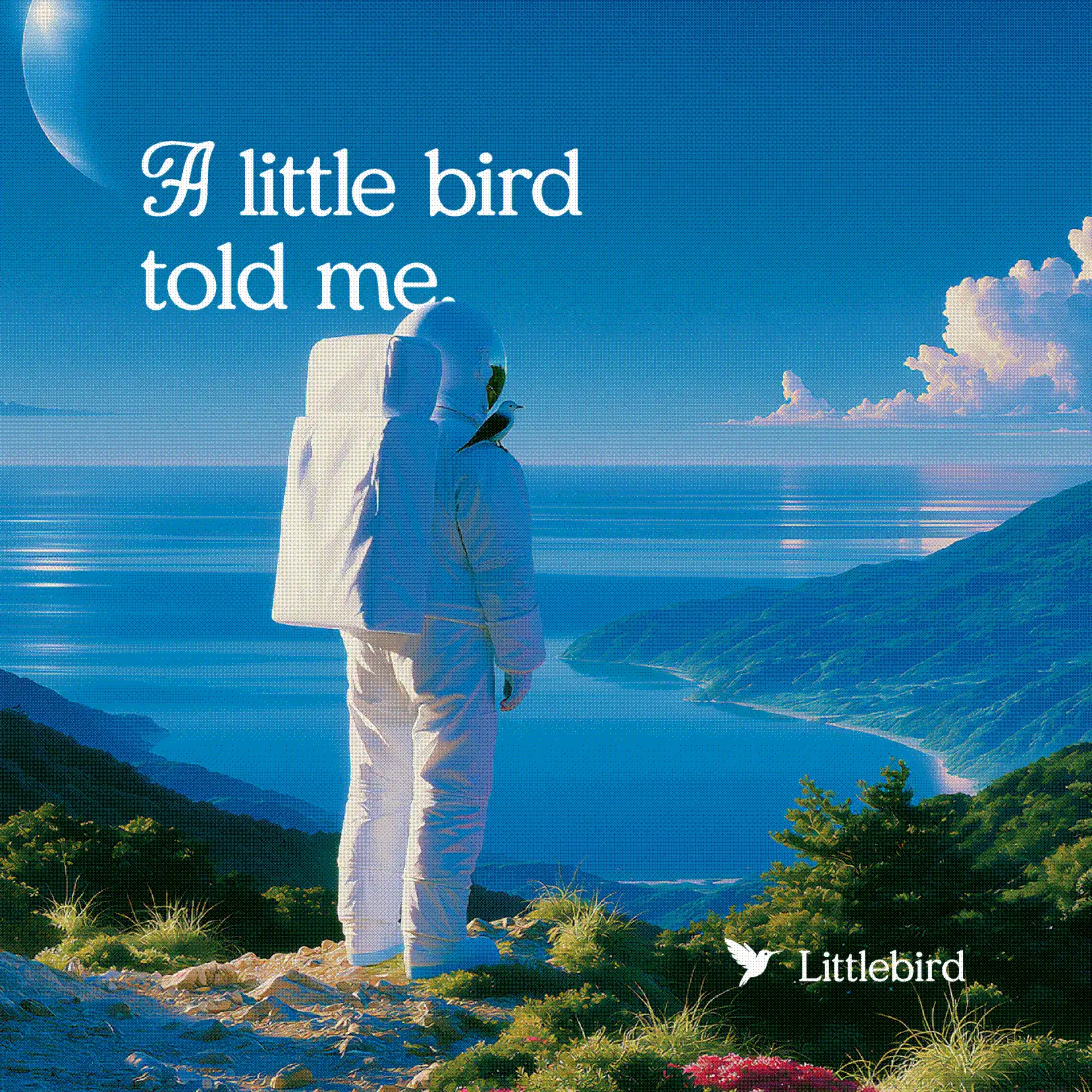
The first screen anyone sees should feel like Littlebird. One warm card over the astronaut landscape.
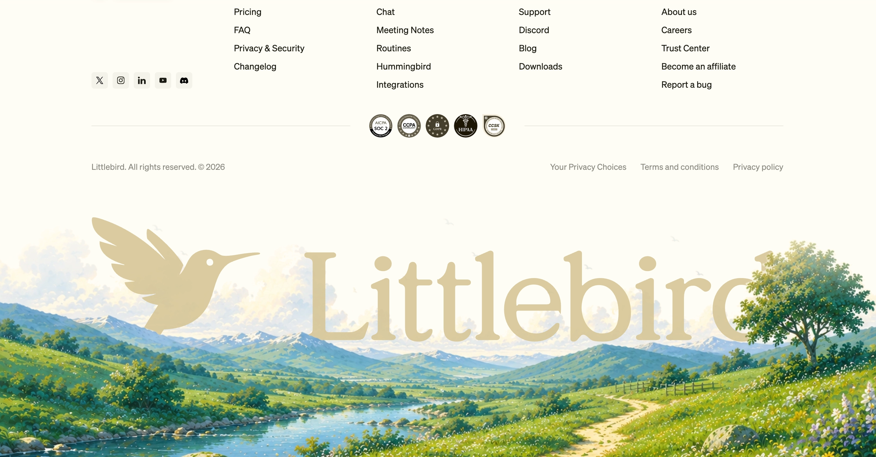
Memory this personal has to be this private, so the homepage says it out loud. The section opens into a dark full-bleed band as you scroll in, the nav flipping with it.
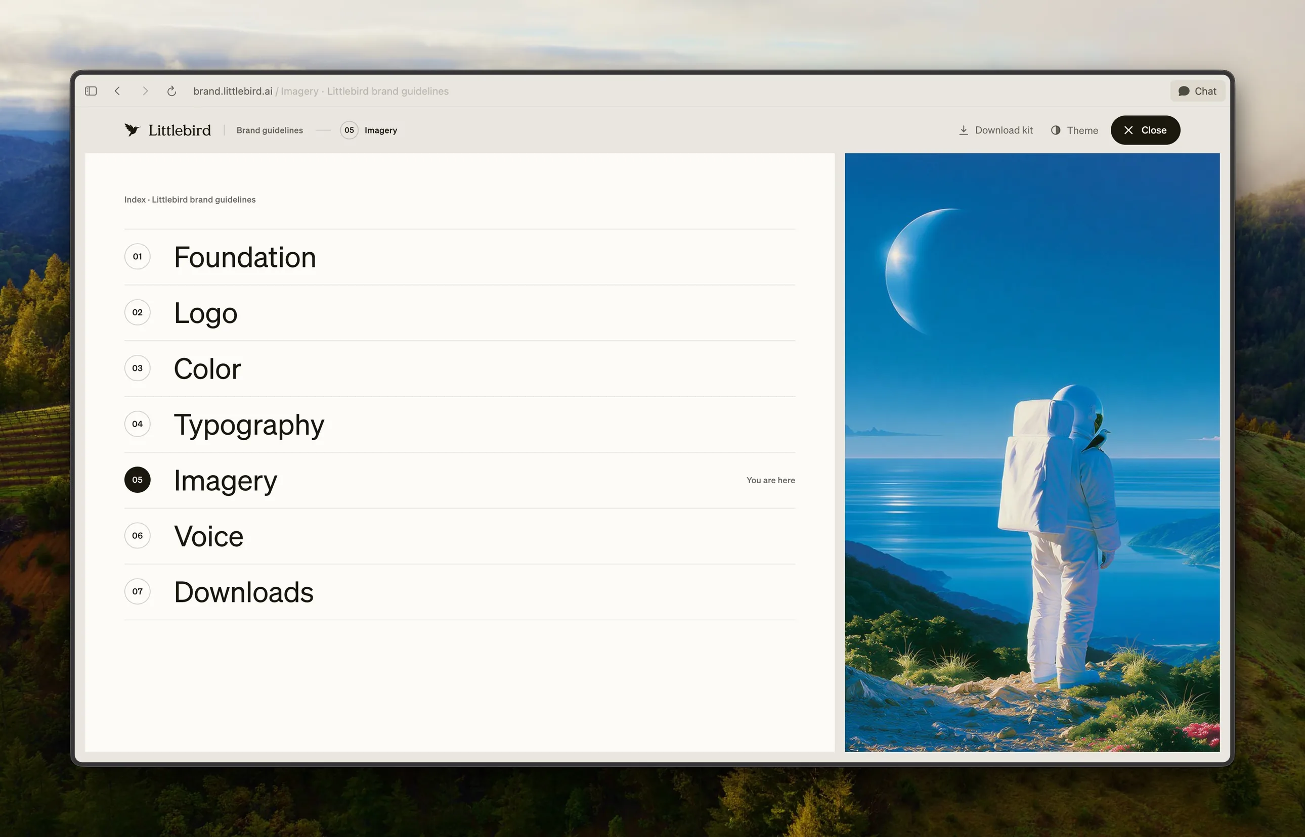
The visual language got a home of its own, designed and built end to end. The whole kit is a download away. Live at brand.littlebird.ai.
The bird in the Dock flaps its wings whenever Littlebird launches or quits.
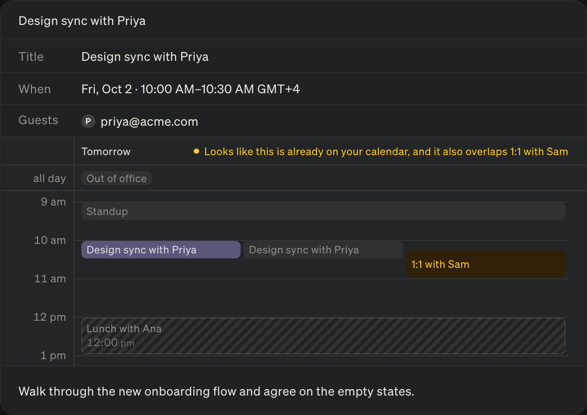
Action cards that create an event now carry a snapshot of your calendar, so you can see how it fits into your day before it's made.
Home on mobile now opens on what's next: your upcoming meeting, and everything waiting on you.
New tabs for projects on iOS. The one you're on shows its name, the rest fold into icons.
What the feed shows when you're all caught up.
