
Designing a better online fitness experience for 100ms
Timeline
2021, 2 months
What is 100ms?
100ms sells video SDK solutions to companies where the video is a core component of their business.
100ms wants to also build a modular product on top of their SDKs so they can offer a more complete solution to companies that need it. While the product is modular and customizable, a few configurations exist for the most common use cases (education, fitness, events, telehealth, among others). This particular case-study focuses on the fitness experience.
Project Objective
Design a better fitness experience for the stakeholders by solving their major pain-points.
→ Help companies build their own product using pre-built components, or
→ Start off with a configuration of components and modify it if they want

Requirement Gathering
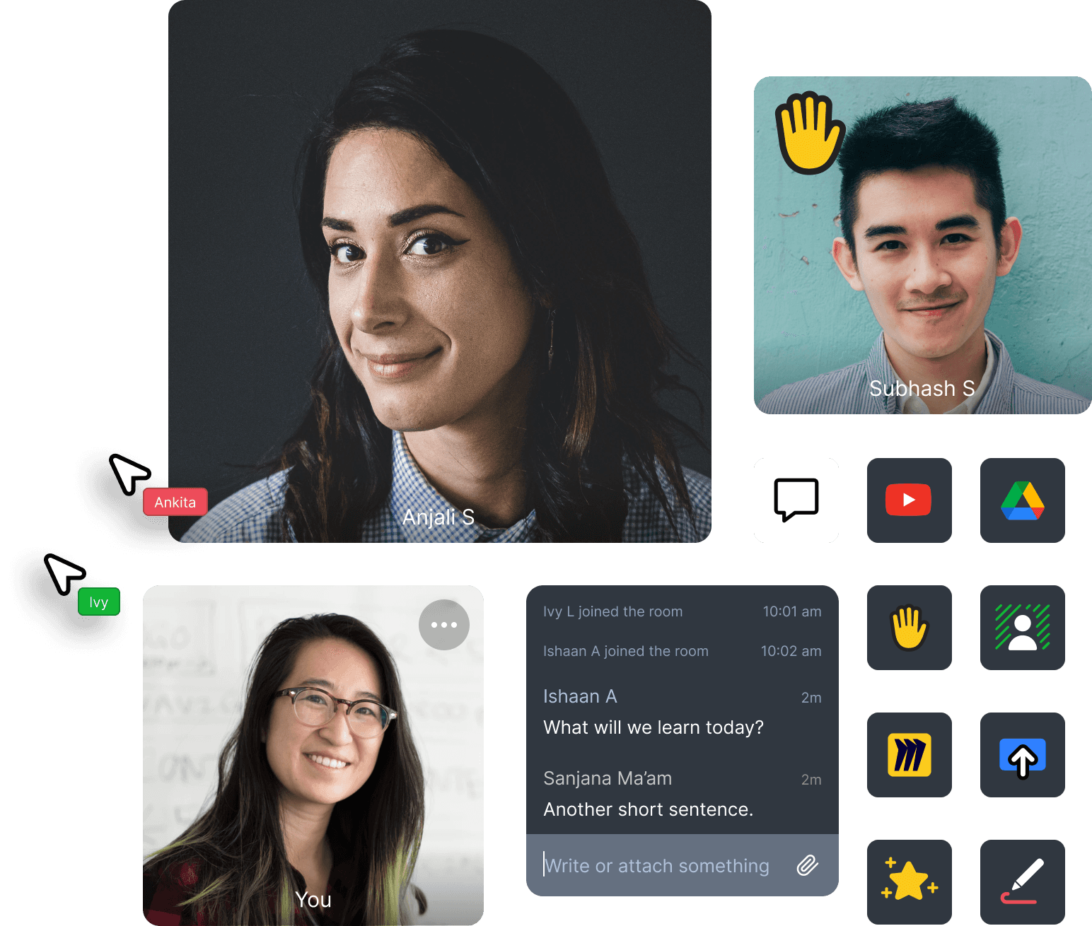
It was important to identify who we are the stakeholders are. To create a better experience and understand their pain-points.
We classified stakeholders into two groups and identified their needs:
Primary stakeholders — C-suite executives, product managers, or engineering managers. They are the primary decision-makers working with 100ms.
Secondary stakeholders — developers, instructors and students. Their needs heavily influence the primary stakeholders.
Research
It was important to identify who we are the stakeholders are. To create a better experience and understand their pain-points.
A key component of the research process was conducting an analysis on how other online fitness products were doing. This allowed me to develop ideas about user experience as well as what other competitors are already doing.
What fitness companies want to achieve
We spoke to product people and stakeholders at fitness companies. Here’s what they want:
→ Tailor-made product — Fitness companies were using clients like Zoom and Google Meet as ad hoc solutions but wanted a more tailor-made product for instructors and students.
→ “Just works” experience — they want their instructors and students to have a seamless experience. No Zoom links, or license juggling.
→ Security and privacy — securely inviting people, protection against Zoombombing.
→ Quality of life features — incognito mode for students, playing music using Spotify, groups/breakout rooms, and features designed to delight end users.
Conceptualisation and Ideation
Keeping the above-mentioned pointers in mind I used the “Context mapping” to conceptualise the users’ needs and actions they need to perform.
The reason why I decided to take the research a step further with context mapping was that you only know what the user tells you, i.e. you’re touching the surface. On the other hand, context mapping allows you to extract deeper insights by understanding the user in their context — a way for them to show you their world.
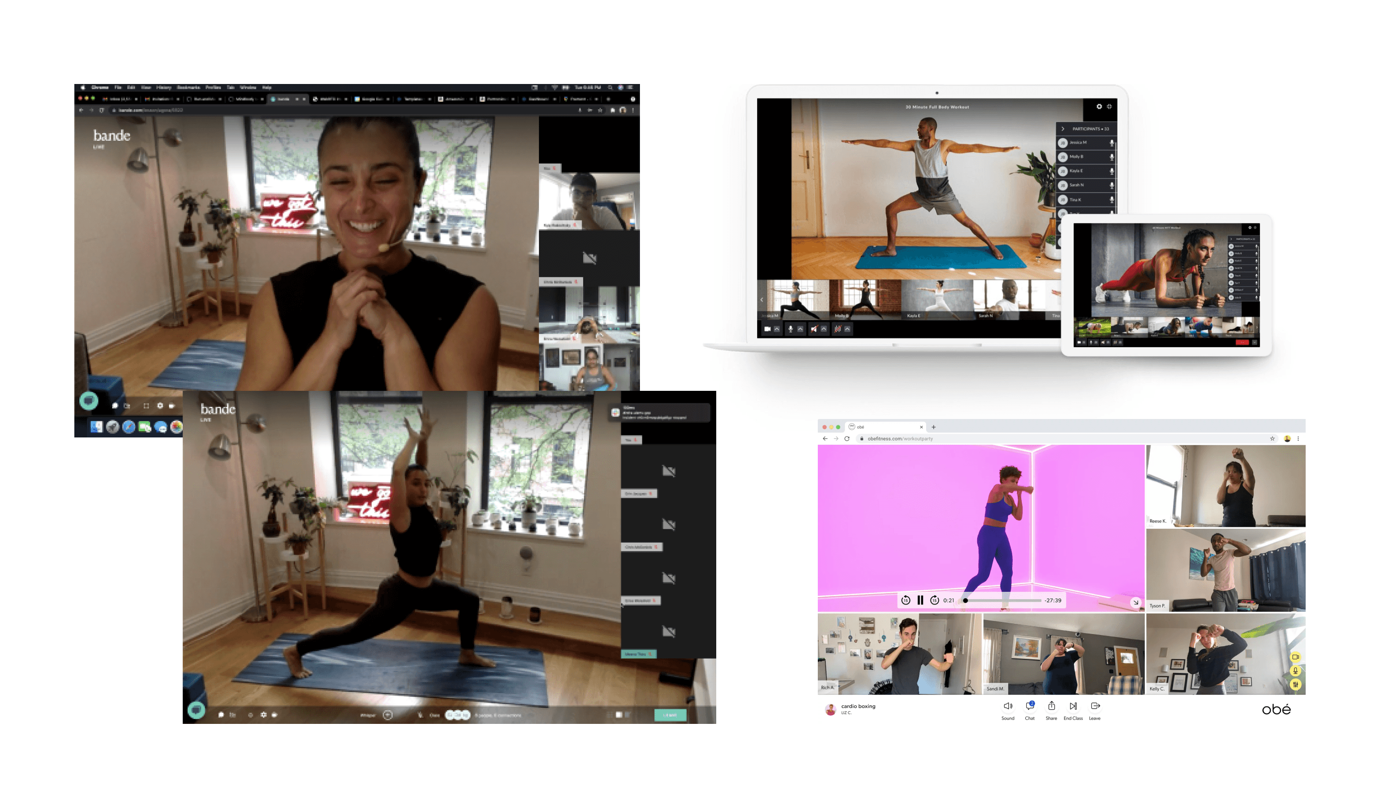
I used and played around with other online fitness communities and apps to understand users’ needs and get insights on how they use it. We wanted to help them get a better experience than Zoom or Google Meet or any other video conferencing app. Fitness classes can be difficult for some students, they don’t want to display their video to other students who they don’t even know or they may want to experience the classes with their friends.
So we wanted to address these issues that users have and how we can solve them through our app. Here are some features that we implemented to get the stakeholders a better online fitness experience:
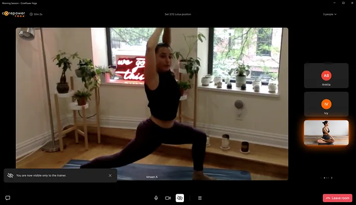
🙈 Incognito Mode
Users can choose to be incognito, where only the trainer can see them, but no other participant can. This introduces a choice to keep their video private and give them a judgment-free environment to workout/engage in.
🔐 Common Authentication
No Zoom links, or license juggling. Each time you join a Zoom session, you must find the Zoom URL from whichever source you have — invite emails, calendar event details, or links from your instructors on WhatsApp. You then wait for the browser to load and redirect you to the Zoom app. Most people have adapted to this process by either joining sessions two minutes early or by spending the first few minutes of each session waiting for everyone’s presence. 100ms allows instructors and students to seamlessly click open from inside the client’s app.
👯♀️ Groups
Working out online can be lonely sometimes when we are used to working out together in gyms. This feature allows students to exercise with their friends in groups. It is interactive so you can chat with a friend while you workout together, or build meaningful connections with instructors and other members, both in and out of class, making it feel closer to real life.
🎵 First-class Spotify integration
Instructors can play Spotify playlists or music from any other app within the session itself. This avoids the trouble of screensharing, or playing music in the background. Play music straight from the app to the motivation of the workouts flowing.
🖥 Play pre-recorded videos
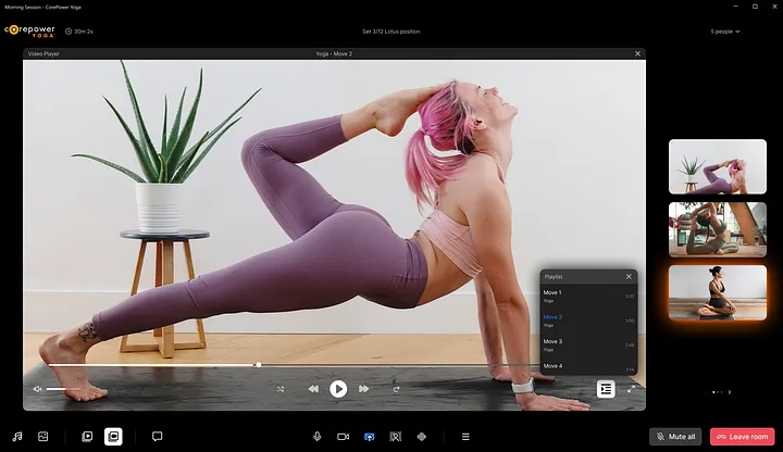
Instructors can play pre-recorded videos with the help of an in-app player. This allows them to show how-to videos or play pre-recorded sessions to their students.
📺 Stream to YouTube
Taking your session one step further. Instructors can stream their sessions to YouTube or Twitch with a custom layout. Instructors can also record their classes, so students who missed the session can watch and workout later. More people, more fun. 🏋️
Visual Design
Design system is pivotal
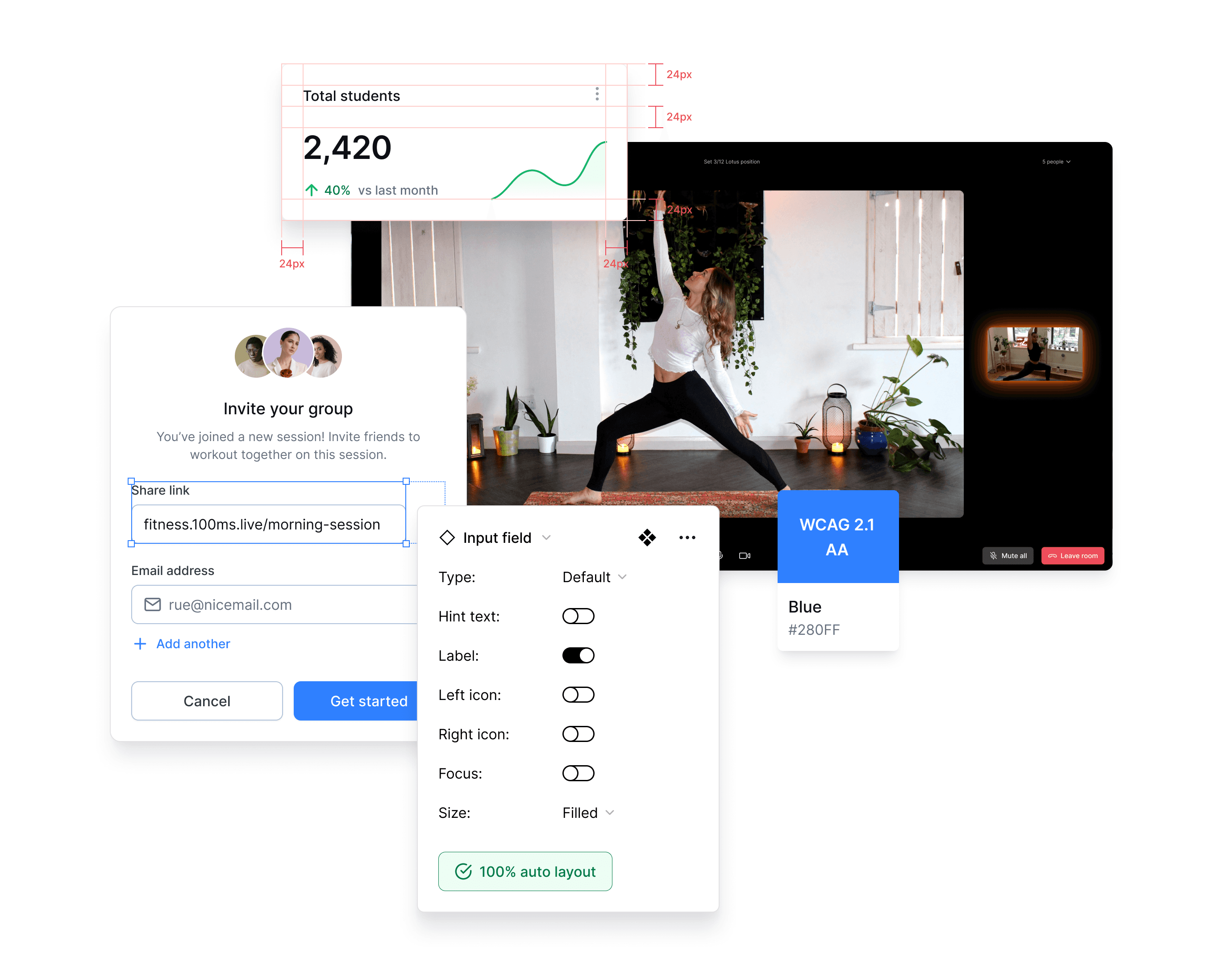
A design system would be crucial for making this work. The product is modular, so the design should be too. 100ms already has a design system in place, which we used to make other experiences like edtech apps and virtual events, which made it easier to implement these features to the app.
Bringing it all together
🔐 Pre-join
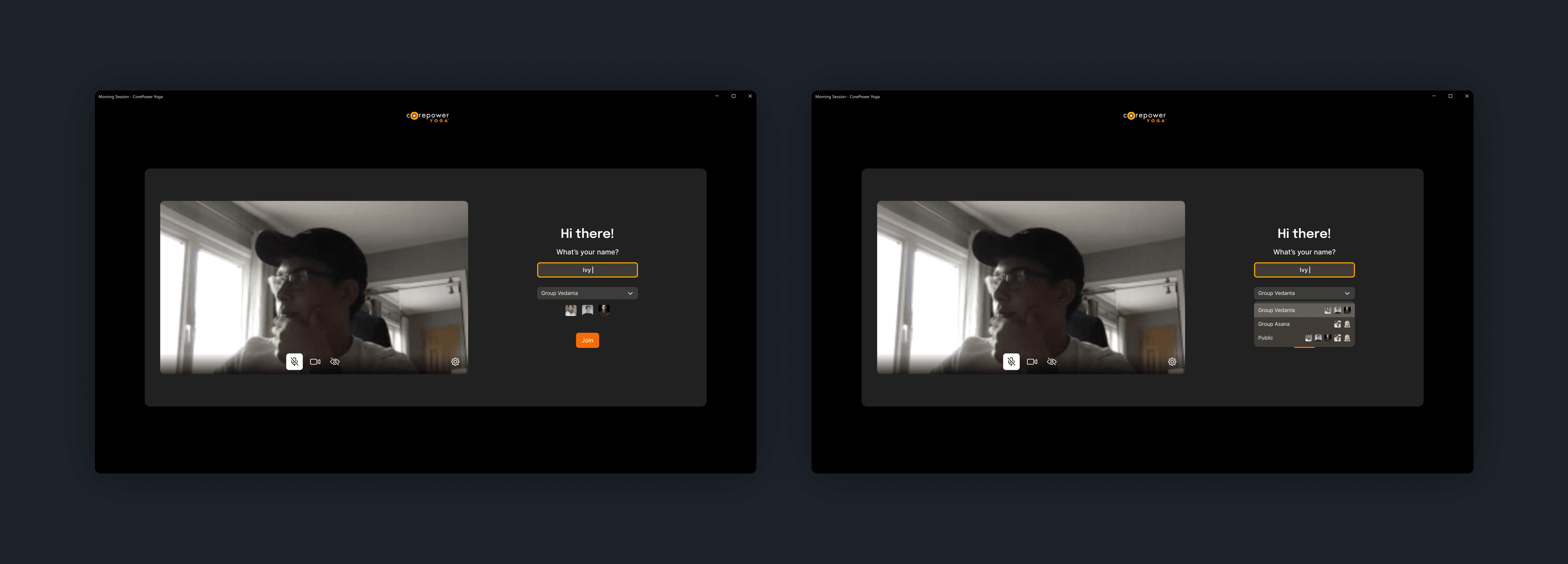
You follow a link that brings you to a “pre-join” screen. This is different for an instructor and a student. You can adjust your settings and check your appearance before joining.
As a student, you can join groups to workout with your friends, and your friend's avatars are shown adjacent to the group, and you can also turn on incognito mode.
🙈 Incognito mode
Students can turn on Incognito mode so that only the trainer can see their video.
📺 Play videos
Instructors can play pre-recorded videos.
🔇 Mute video/audio
Instructors can mute a student’s video or audio.
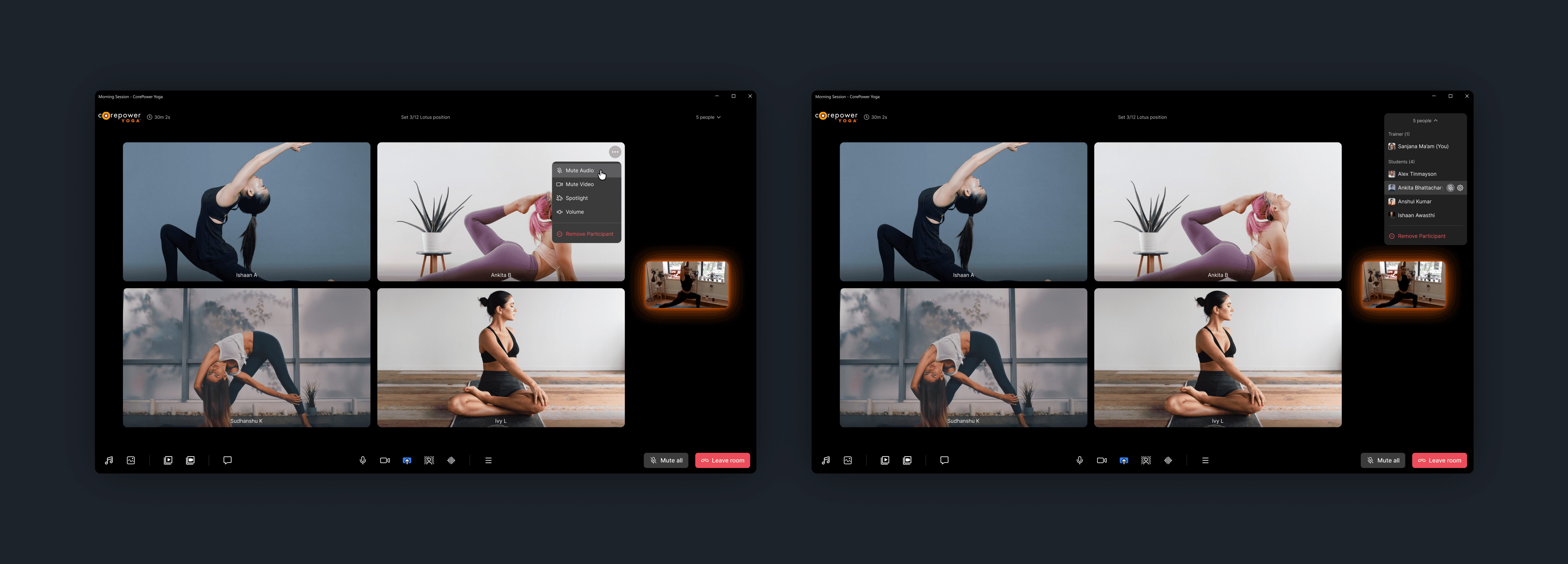
👥 Custom layouts for different roles
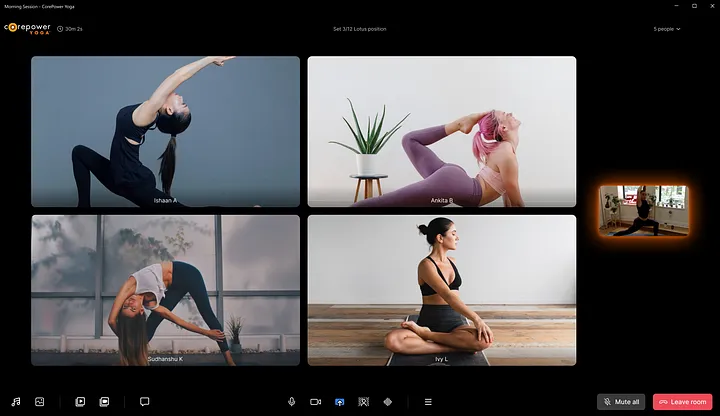
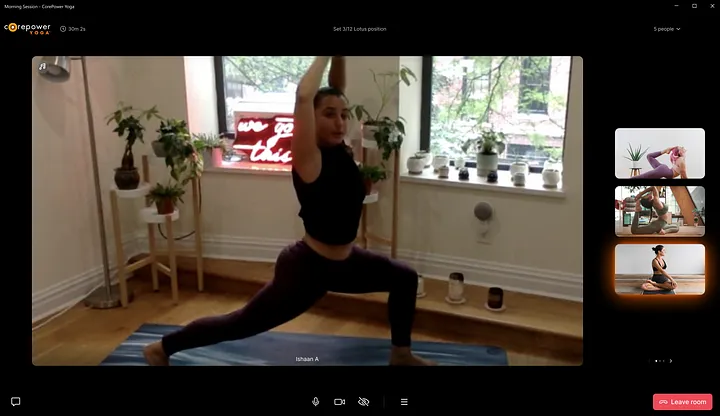
For an instructor, it’s important that they see all the students at once and have full control over the class. But for students, it’s important that they see the instructor prominently.
Instructor view
Student view
Here, the instructor takes the main focus, to allow the student to view the moves more prominently.
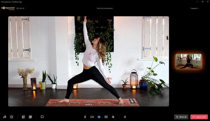
Spotlight view
Spotlight mode allows the teacher to give the center of attention to a particular student.
Reflection
Working on the project emphasized the importance of understanding user needs, iterative design, and the delicate balance between aesthetics and usability. Ensuring content organization, personalization, accessibility, and effective collaboration were key challenges. Ultimately, this project highlights how thoughtful design can significantly enhance digital experiences for users in niche markets like online fitness.
I hope this deep dive has left you with new insight into building robust and modular products that “just work”.
To learn more about 100ms, check out www.100ms.live
Back to home

Case study: Designing a better
online fitness experience for 100ms
Timeline
2021, 2 months

What is 100ms?
100ms sells video SDK solutions to companies where the video is a core component of their business.
100ms wants to also build a modular product on top of their SDKs so they can offer a more complete solution to companies that need it. While the product is modular and customizable, a few configurations exist for the most common use cases (education, fitness, events, telehealth, among others). This particular case-study focuses on the fitness experience.
Project Objective
Design a better fitness experience for the stakeholders by solving their major pain-points.
→ Help companies build their own product using pre-built components, or
→ Start off with a configuration of components and modify it if they want


Requirement Gathering
It was important to identify who we are the stakeholders are. To create a better experience and understand their pain-points.

We classified stakeholders into two groups and identified their needs:
Primary stakeholders — C-suite executives, product managers, or engineering managers. They are the primary decision-makers working with 100ms.
Secondary stakeholders — developers, instructors and students. Their needs heavily influence the primary stakeholders.
Research
It was important to identify who we are the stakeholders are. To create a better experience and understand their pain-points.
A key component of the research process was conducting an analysis on how other online fitness products were doing. This allowed me to develop ideas about user experience as well as what other competitors are already doing.
What fitness companies want to achieve
We spoke to product people and stakeholders at fitness companies. Here’s what they want:
→ Tailor-made product — Fitness companies were using clients like Zoom and Google Meet as ad hoc solutions but wanted a more tailor-made product for instructors and students.
→ “Just works” experience — they want their instructors and students to have a seamless experience. No Zoom links, or license juggling.
→ Security and privacy — securely inviting people, protection against Zoombombing.
→ Quality of life features — incognito mode for students, playing music using Spotify, groups/breakout rooms, and features designed to delight end users.
Conceptualisation and Ideation
Keeping the above-mentioned pointers in mind I used the “Context mapping” to conceptualise the users’ needs and actions they need to perform.
The reason why I decided to take the research a step further with context mapping was that you only know what the user tells you, i.e. you’re touching the surface. On the other hand, context mapping allows you to extract deeper insights by understanding the user in their context — a way for them to show you their world.

I used and played around with other online fitness communities and apps to understand users’ needs and get insights on how they use it. We wanted to help them get a better experience than Zoom or Google Meet or any other video conferencing app. Fitness classes can be difficult for some students, they don’t want to display their video to other students who they don’t even know or they may want to experience the classes with their friends.
So we wanted to address these issues that users have and how we can solve them through our app. Here are some features that we implemented to get the stakeholders a better online fitness experience:
🙈 Incognito Mode
Users can choose to be incognito, where only the trainer can see them, but no other participant can. This introduces a choice to keep their video private and give them a judgment-free environment to workout/engage in.
🔐 Common Authentication
No Zoom links, or license juggling. Each time you join a Zoom session, you must find the Zoom URL from whichever source you have — invite emails, calendar event details, or links from your instructors on WhatsApp. You then wait for the browser to load and redirect you to the Zoom app. Most people have adapted to this process by either joining sessions two minutes early or by spending the first few minutes of each session waiting for everyone’s presence. 100ms allows instructors and students to seamlessly click open from inside the client’s app.
👯♀️ Groups
Working out online can be lonely sometimes when we are used to working out together in gyms. This feature allows students to exercise with their friends in groups. It is interactive so you can chat with a friend while you workout together, or build meaningful connections with instructors and other members, both in and out of class, making it feel closer to real life.
🎵 First-class Spotify integration
Instructors can play Spotify playlists or music from any other app within the session itself. This avoids the trouble of screensharing, or playing music in the background. Play music straight from the app to the motivation of the workouts flowing.
🖥 Play pre-recorded videos
Instructors can play pre-recorded videos with the help of an in-app player. This allows them to show how-to videos or play pre-recorded sessions to their students.
📺 Stream to YouTube
Taking your session one step further. Instructors can stream their sessions to YouTube or Twitch with a custom layout. Instructors can also record their classes, so students who missed the session can watch and workout later. More people, more fun. 🏋️
Visual Design
Design system is pivotal
A design system would be crucial for making this work. The product is modular, so the design should be too. 100ms already has a design system in place, which we used to make other experiences like edtech apps and virtual events, which made it easier to implement these features to the app.

Bringing it all together
🔐 Pre-join
You follow a link that brings you to a “pre-join” screen. This is different for an instructor and a student. You can adjust your settings and check your appearance before joining.
As a student, you can join groups to workout with your friends, and your friend's avatars are shown adjacent to the group, and you can also turn on incognito mode.

🙈 Incognito mode
Students can turn on Incognito mode so that only the trainer can see their video.

📺 Play videos
Instructors can play pre-recorded videos.

🔇 Mute video/audio
Instructors can mute a student’s video or audio.

👥 Custom layouts for different roles
For an instructor, it’s important that they see all the students at once and have full control over the class. But for students, it’s important that they see the instructor prominently.
Instructor view

Student view
Here, the instructor takes the main focus, to allow the student to view the moves more prominently.

Spotlight view
Spotlight mode allows the teacher to give the center of attention to a particular student.

Reflection
Working on the project emphasized the importance of understanding user needs, iterative design, and the delicate balance between aesthetics and usability. Ensuring content organization, personalization, accessibility, and effective collaboration were key challenges. Ultimately, this project highlights how thoughtful design can significantly enhance digital experiences for users in niche markets like online fitness.
I hope this deep dive has left you with new insight into building robust and modular products that “just work”.
To learn more about 100ms, check out www.100ms.live
Back to home

Designing a better online fitness experience for 100ms
Timeline
2021, 2 months

What is 100ms?
100ms sells video SDK solutions to companies where the video is a core component of their business.
100ms wants to also build a modular product on top of their SDKs so they can offer a more complete solution to companies that need it. While the product is modular and customizable, a few configurations exist for the most common use cases (education, fitness, events, telehealth, among others). This particular case-study focuses on the fitness experience.
Project Objective
Design a better fitness experience for the stakeholders by solving their major pain-points.
→ Help companies build their own product using pre-built components, or
→ Start off with a configuration of components and modify it if they want


Requirement Gathering
It was important to identify who we are the stakeholders are. To create a better experience and understand their pain-points.

We classified stakeholders into two groups and identified their needs:
Primary stakeholders — C-suite executives, product managers, or engineering managers. They are the primary decision-makers working with 100ms.
Secondary stakeholders — developers, instructors and students. Their needs heavily influence the primary stakeholders.
Research
It was important to identify who we are the stakeholders are. To create a better experience and understand their pain-points.
A key component of the research process was conducting an analysis on how other online fitness products were doing. This allowed me to develop ideas about user experience as well as what other competitors are already doing.
What fitness companies want to achieve
We spoke to product people and stakeholders at fitness companies. Here’s what they want:
→ Tailor-made product — Fitness companies were using clients like Zoom and Google Meet as ad hoc solutions but wanted a more tailor-made product for instructors and students.
→ “Just works” experience — they want their instructors and students to have a seamless experience. No Zoom links, or license juggling.
→ Security and privacy — securely inviting people, protection against Zoombombing.
→ Quality of life features — incognito mode for students, playing music using Spotify, groups/breakout rooms, and features designed to delight end users.
Conceptualisation and Ideation
Keeping the above-mentioned pointers in mind I used the “Context mapping” to conceptualise the users’ needs and actions they need to perform.
The reason why I decided to take the research a step further with context mapping was that you only know what the user tells you, i.e. you’re touching the surface. On the other hand, context mapping allows you to extract deeper insights by understanding the user in their context — a way for them to show you their world.

I used and played around with other online fitness communities and apps to understand users’ needs and get insights on how they use it. We wanted to help them get a better experience than Zoom or Google Meet or any other video conferencing app. Fitness classes can be difficult for some students, they don’t want to display their video to other students who they don’t even know or they may want to experience the classes with their friends.
So we wanted to address these issues that users have and how we can solve them through our app. Here are some features that we implemented to get the stakeholders a better online fitness experience:
🙈 Incognito Mode
Users can choose to be incognito, where only the trainer can see them, but no other participant can. This introduces a choice to keep their video private and give them a judgment-free environment to workout/engage in.
🔐 Common Authentication
No Zoom links, or license juggling. Each time you join a Zoom session, you must find the Zoom URL from whichever source you have — invite emails, calendar event details, or links from your instructors on WhatsApp. You then wait for the browser to load and redirect you to the Zoom app. Most people have adapted to this process by either joining sessions two minutes early or by spending the first few minutes of each session waiting for everyone’s presence. 100ms allows instructors and students to seamlessly click open from inside the client’s app.
👯♀️ Groups
Working out online can be lonely sometimes when we are used to working out together in gyms. This feature allows students to exercise with their friends in groups. It is interactive so you can chat with a friend while you workout together, or build meaningful connections with instructors and other members, both in and out of class, making it feel closer to real life.
🎵 First-class Spotify integration
Instructors can play Spotify playlists or music from any other app within the session itself. This avoids the trouble of screensharing, or playing music in the background. Play music straight from the app to the motivation of the workouts flowing.
🖥 Play pre-recorded videos
Instructors can play pre-recorded videos with the help of an in-app player. This allows them to show how-to videos or play pre-recorded sessions to their students.
📺 Stream to YouTube
Taking your session one step further. Instructors can stream their sessions to YouTube or Twitch with a custom layout. Instructors can also record their classes, so students who missed the session can watch and workout later. More people, more fun. 🏋️
Visual Design
Design system is pivotal
A design system would be crucial for making this work. The product is modular, so the design should be too. 100ms already has a design system in place, which we used to make other experiences like edtech apps and virtual events, which made it easier to implement these features to the app.

Bringing it all together
🔐 Pre-join
You follow a link that brings you to a “pre-join” screen. This is different for an instructor and a student. You can adjust your settings and check your appearance before joining.
As a student, you can join groups to workout with your friends, and your friend's avatars are shown adjacent to the group, and you can also turn on incognito mode.

🙈 Incognito mode
Students can turn on Incognito mode so that only the trainer can see their video.

📺 Play videos
Instructors can play pre-recorded videos.

🔇 Mute video/audio
Instructors can mute a student’s video or audio.

👥 Custom layouts for different roles
For an instructor, it’s important that they see all the students at once and have full control over the class. But for students, it’s important that they see the instructor prominently.
Instructor view

Student view
Here, the instructor takes the main focus, to allow the student to view the moves more prominently.

Spotlight view
Spotlight mode allows the teacher to give the center of attention to a particular student.

Reflection
Working on the project emphasized the importance of understanding user needs, iterative design, and the delicate balance between aesthetics and usability. Ensuring content organization, personalization, accessibility, and effective collaboration were key challenges. Ultimately, this project highlights how thoughtful design can significantly enhance digital experiences for users in niche markets like online fitness.
I hope this deep dive has left you with new insight into building robust and modular products that “just work”.
To learn more about 100ms, check out www.100ms.live
Back to home